x
Portugieser Perpetual Calendar Black Dial or White?
- 6 replies
- last reply by fairgreen 18 Jun 2018
-
 Apprentice
 -
 Connoisseur
These are two great PPC you are looking at for sure!
Personally I am a fan of the "cigar cutter" double moon phase and in best case with a white dial.
When I look at your two options, I think I would also go with the white dial and single moon as somehow the back dial with the red gold case feels too much for me. -
 Apprentice
I'm a fan of the double moon phase as it is unique to IWC. The single moon phase is a moon phase display other brands also deliver.
If you prefer a white dial I would recommend to have a look at a second hand IW502111 in Platinum. There are trusted second hand dealer offering the watch at a price below of a new PPC. The case of the Pt PPC is bolder and the disk of the double moonphase does not have the stars - what I prefer.

A third option would be the blue PPC IW503401. As the IWC Marketing gurus state "blue is the new black":

My proposals are clearly based on personal taste. Up to you to decide.
-
Apprentice
-
 Master
Both options are superb. The black dial is rather slate / ardoise than black and it looks awesome. Readability looks OK to me but unfortunately I cannot tell you as an owner / wearer of that watch. I love the silver dial/single moon option as well but the black double moon is really awesome! Go and you won't regret it!
-
 Insider
You can not go wrong with either one!
Did you see both in the metal already and put it in the wrist?
This will help a lot and maybe the decision is easier afterwards.
For sure the ardoise dial is not be overseen, specially with the red gold.Me personally I would go for the white gold and blue face double moon,
or the single moon with red gold and white face.I wish you a happy decision and wrist shots for us ;)
Regards, Markus
-
 Insider
I would suggest if available from your local boutique, look at the Jubilee Perpetual Calendar with white lacquer dial, blue hands and blue double moonphase disc. Matched a rose gold case, it's probably the best combo of the rose gold Perpetual Calendars and it's a limited edition of 250 pieces for roughly the same price.
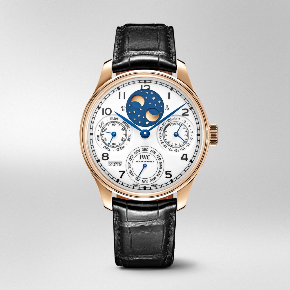
I tried on all three rose gold models at the Madison Avenue boutique recently and suggest you do the same. I found the slate dial to be very tough to read under light and the white dials to be easier on the eyes. The blue dial on the white gold case is very readable, but the Jubilee is the clear winner if you're going that route.