• Master
    17 Aug 2012, 2:44 p.m.

    Most of us here love IWC, and the many reasons have been well documented. Whether it is the company history, the superbly engineered movements, the understated elegance, "Probus Scafusia", or any of the myriad other reasons we often discuss, there is a lot to love in this brand.

    I was looking through my watch box to choose a watch the other day, and a realization came over me. Each and every one of my IWC has some little detail that particularly captivates me and endears the watch to me. Let me illustrate with some examples.

    My first IWC love was, and remains, the Portuguese line. I fell in love as soon as I saw this photo of twin 3531's, originally posted on another site by Ray Purkis.

    www.fototime.com/%7B8EEACB26-9C21-46F1-9E0C-C339A38EEFBA%7D/origpict/IWC%25203531.jpg

    For me, there has never been anything quite like that soft, grainy, silver-white Portuguese dial. Despite having owned many different Portuguese models with that dial, I have never been able to capture in a photo what I see on the watch. Maybe because my photographic abilities amount to point, shoot, and post? I made one last try below, but still missed. Those of you who know the dial know what I'm talking about. Perhapos a better photographer can help me out here?

    www.fototime.com/%7B9D2BD529-AC65-44A5-9801-6FDA5085449D%7D/origpict/DSCN6748.JPG

    So on to the Pisa Portuguese. This became a grail for me as soon as I saw it.

    www.fototime.com/%7BA7770C44-18D7-4937-A159-5506114088AB%7D/origpict/DSCN6249.JPG

    It is amazing to me how such a seemingly plain appearing, time only steel watch draws such positive comments from whoever sees it. The feature that stands out to me is the font of the numerals. I melt every time I see them, especially the 1, 2 and 7.

    www.fototime.com/%7BC8977B8A-69D4-4C11-87FF-EF8B8DBC2273%7D/origpict/DSCN6750.JPG
    www.fototime.com/%7B0072AF19-4FA6-45DE-9F99-D2E386156C67%7D/origpict/DSCN6752.JPG

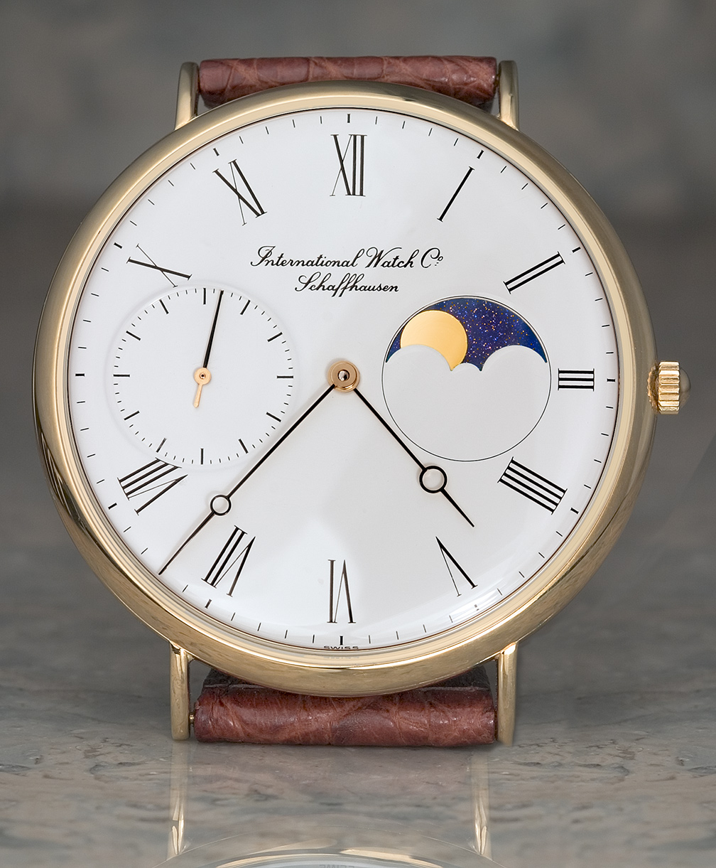
    It seems that an increasing number of us here have the 5251 Portofino Moonphase.

    www.fototime.com/%7B3CACD5C2-AA2F-4584-96C3-43500C22517E%7D/origpict/Port%2520Pair.jpg

    Have you ever seen anything quite like the starry background of the moonphase on these watches? Again, my photo abilities are limited, so I'll use a photo taken by my good friend Steve G to illustrate.

    ninanet.net/watches/others05/Mediums/mIWC5251f12.jpg

    I am one of the few guys who never "got" the Big Pilot. I don't know why, but it just never spoke to me. It has become such a classic, I often felt I was the only person in the world who didn't "get it". I finally took one in trade, figuring it would be easier to sell for cash than the watches I gave up for it. When it arrived, I figured I'd at least try it on.

    www.fototime.com/%7B6641F76A-B034-4D99-B78F-C2A608F9C2BF%7D/origpict/DSCN6671.JPG

    It didn't leave my wrist for 2 weeks, and never has left my little collection since then. It's that long slender second hand that captivates me. I could sit and watch it all day. So sleek! So graceful! Like watching Elle McPherson walk down the street.

    On to the Aquatimer 3568. The white dial model has become a crowd favorite around here, and I thank Bill Barker for turning me on to it through his photos.

    www.fototime.com/%7B8B4613CE-4959-4641-8162-19E67047D8FD%7D/origpict/IWC%2520Aquatimer%25202000%2520008%5B1%5D.jpg

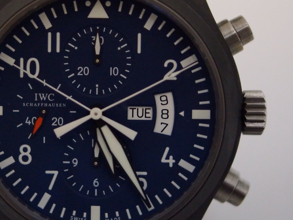
    I like the way it has a cooling look in the Summer yet brings the pleasure of a crisp clear day after a fresh snowfall in the Winter. For me, that little yellow tip on the second hand makes a huge difference. Much like the touch of red on the 3717 pilot chrono, that hint of color provides such a warming touch to the otherwise Zhivago-like landscape of the dial.

    www.fototime.com/%7B7A78A429-5A67-43AB-BF46-EB3102A60ACA%7D/origpict/IWC%2520Aquatimer%25202000%2520015%5B1%5D.jpg

    That brings me to the 3227 Ingenieur, which has become a true IWC classic.

    www.fototime.com/%7BF5DA14AA-69E4-4422-97DE-F83BB19964D3%7D/origpict/DSCN6360%2520%28Large%29.JPG

    I admit, I didn't like the watch when I first saw it, and I didn't even try to get a CFI. Probably the biggest mistake I ever made in watches! But I corrected that as best I could, and at least I have a 3227. The dial texture is just amazing!

    www.fototime.com/%7B6746B6D3-D789-4642-8DB8-7665C80BA6C8%7D/origpict/DSCN6755.JPG

    Well, I've droned on long enough. That's it for me. A tiny design feature on each of my IWC's that makes a huge impact.

    How about you? What small design feature on your IWC grabs hold of you and won't let go?

  • Master
    17 Aug 2012, 3:18 p.m.

    Hi Dick,

    Great post with lovely photos and wonderful attention to detail.

    Thanks for sharing your thoughts (and your love) for these beautiful and artful timekeeping pieces.

    Cheers!

  • Master
    17 Aug 2012, 3:40 p.m.

    A very nice perspective on a wonderful collection. Thanks for sharing. The 5251 is the one that fascinates me and has not made it to my collection. But, it's a close call to like it more than the RG Jubilee.

  • Master
    17 Aug 2012, 3:41 p.m.

    Dick,
    Great post, love the pictures. You are so right, its the attention to the little details that make us love this brand.
    Enjoy your weekend.

    Regards,
    Kevin

  • Connoisseur
    17 Aug 2012, 4:11 p.m.

    Indeed, the devil is in the details.

    Nice post, Dick...a great contribution.

  • Master
    17 Aug 2012, 7:55 p.m.

    Thank you Dick for this wonderful post. You have a splendid collection and I agree that the details are stunning.

    Kind regards,

    Clemens

  • Master
    17 Aug 2012, 8:23 p.m.

    Poetic post, I loved to read it!

    A true declaration of love. Thanks Dick.

    Fine for me, Elle McPherson is a Big Pilot, Cate Blanchett is a Portuguese!

    i294.photobucket.com/albums/mm101/flyrobyfly/57ca5546.jpg

  • Master
    17 Aug 2012, 11:30 p.m.

    Dick, I enjoy each and every post on the forum. But this post of your is pure IWC through and through! I've just finished reading it a 2nd time and you noticed that you got it all down so perfectly.

    Thanks for sharing this with us.

  • Master
    18 Aug 2012, 2:22 a.m.

    Hello Dick:

    Great post ! I feel the same way about the little details. It's just one of the many things that set IWC apart.

    A couple examples of the small details that excite me;

    • Port Chrono 3714/RG markers...really like the way the counter hands are blued. Makes the dial so sporty as does the flared chapter ring.

    • Laureus VC-Ing...Hypnotic Blue dial, stunning. Red arrow tip on seconds hand, nice touch.

    • VC-AT (hopefully inbound soon) ...Double crowns and bezel under glass, unique and beautiful.

    Thanks again Dick for the posting. It helps remind us of the reasons we are all so passionate about our IWC's.

    Regards,

    Andy

  • Master
    18 Aug 2012, 3:55 a.m.

    Great post Dick!

    For me it's the following:

    On the St Ex it's the great lume, the A and the brown dial.
    i69.photobucket.com/albums/i49/lndblr/6697e48c.jpg

    On the DFB'S it's the hidden yellow in each watch.

    i69.photobucket.com/albums/i49/lndblr/2e456f8f.jpg

    On the Carlson Doppel it's the white calendar window.

    i69.photobucket.com/albums/i49/lndblr/697a465f.jpg

    On the BPP it's the red markers

    i69.photobucket.com/albums/i49/lndblr/76d81e07.jpg

    On the Plastiki it is the second hand pointer color

    i69.photobucket.com/albums/i49/lndblr/11509f5d.jpg

    On the GST it is the hands

    i69.photobucket.com/albums/i49/lndblr/38262d62.jpg

    Just a few...

  • Connoisseur
    18 Aug 2012, 5:03 a.m.

    Great post, Dick. I read your post twice.

    Totally agreed with your point, small things make big difference.

    Here is one BP example

    i624.photobucket.com/albums/tt323/felixhcng/79a6f131.jpg

    Small change in dial color, strap style, will change the feeling of the BP.

  • Master
    18 Aug 2012, 5:06 a.m.

    Hi Dick, loved the post! I know the time you must have spent between the photos and the exemplary commentary, thanks for sharing your insight.

    MF said it best........."the devil is in the details"!!!!!

  • Master
    18 Aug 2012, 8:48 a.m.

    Dick - Fantatstic post! As Mark said I enjoy every post on this forum, but this one was special!

    The small thing (or maybe not so small :-)) which drew me to my first IWC love was the very thin bezel and resulting big face of the Portuguese Perpetual Calendar.
    i1105.photobucket.com/albums/h341/Skule/IWC%20PPC%2011-09-2011/IMG_3043.jpg
    To me this creates a kind of a "no fuzz" design, which draws focus to the face of the watch more so than to the watch as a whole. And to top it off that thin bezel is so beautifully crafted!

    For a while I was very unsure whether I wanted the older 5022 (42,2 mm diameter) or the new 5023 (44,1 mm diameter), but I ended up with the 5022 due to the fact that the face of the two have the same size, and the 5022 has a thinner bezel.
    Well, a side effect of that decision is that I now get to enjoy the same sparkling sky in the moonphase display as you can on your Portofino. I have even more appreciation for this part after enjoying a dinner conversation with Lorenz Baerlocher, the Logistiscs Manager at IWC, during our 2012 SIHH dinner. I asked him why this sparkling sky was no longer used in the PPC, but exchanged for the plain blue background with gold stars. He explained how difficult it was to make that sparkling glass and the problems their subsupplier had when machining it into the small pieces they need for the watches. So they changed the design.

    After that I appreciate my 5022 and the beautiful sparkling sky even more!

  • Insider
    18 Aug 2012, 4:07 p.m.

    It is so true the beauty of the dial is hardly to be captured.

    I tried some but still not happy with them. keep trying then.
    i1116.photobucket.com/albums/k566/iwcollector/iwc325port.jpg

  • Master
    18 Aug 2012, 4:28 p.m.

    What a wonderful post, Dick! I still consider the opportunity to try on your Pisa as one of last year's highlights! Thanks for a thoughtful, well photographed tour through your collection...and the details!!!

  • Master
    18 Aug 2012, 5:36 p.m.

    Absolutely right, Dick. Relentless attention to even the smallest details is essential for the creation of truly great things.

  • Master
    18 Aug 2012, 10:01 p.m.

    A wonderful journey, Dick. It's the smallest things that can attract me to a watch and the smallest things that can do the opposite. I suspect I could work on a lengthy post detailing why I didn't buy certain watches but this is not the Forum for that. A great post.

  • 19 Aug 2012, 9:51 a.m.

    Wow
    Great post and thoughts on IWC
    I feel the same with every watch I own.
    The beauty of IWC watches I think is that every look again I see new details that confirm why I love the craftmanship of Schaffhausen
    Thx for posting
    Cheers
    bas dekkers

    Can't decide what watch to wear at this time
    (the're all great)